
I’ll be honest, I don’t really understand how Pantone gets the distinction of picking a color of the year, nor do I really see its practical applications to the fashion world today. For instance, no one I know liked the 2015 color of the year: Marsala. The blasé red/brown is not a flattering color on most people. Personally, I’d stick with the much more vibrant color of cranberry or raspberry.
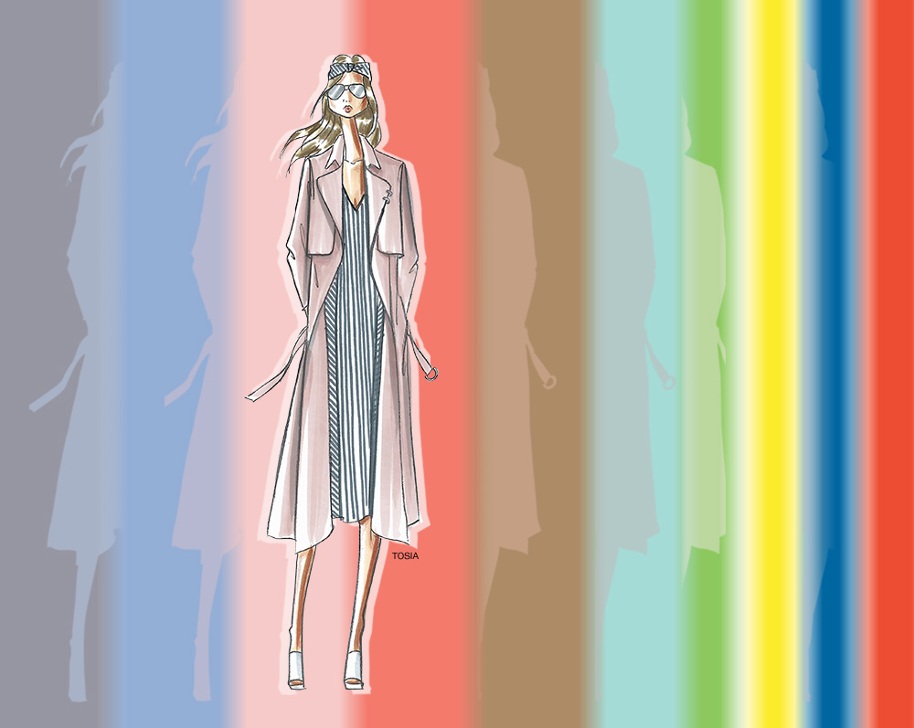
But, alas, Pantone gets the honor of naming the color of the year. For 2016, Pantone is switching it up, and giving two different colors the distinction of color of the year: Rose Quartz and Serenity.
Leatrice Eiseman, executive director of the Pantone Color Institute, said, “Colors this season transport us to a happier, sunnier place where we feel free to express a wittier version of our real selves. With our culture still surrounded by so much uncertainty, we are continuing to yearn for those softer shades that offer a sense of calm and relaxation.”
Serenity hopes to convey the feeling of being ‘weightless and airy, like the expanse of the blue sky above us. Serenity comforts with a calming effect, bringing a feeling of respite even in turbulent times. A transcendent blue, Serenity provides us with a naturally connected sense of space.’
Rose Quartz is meant to be… ‘a persuasive yet gentle tone that conveys compassion and a sense of composure. Like a serene sunset, flushed cheek or budding flower, Rose Quartz reminds us to reflect on our surroundings during the busy but lighthearted spring and summer months.’
Complimentary colors to go along with Serenity and Rose Quartz are: Peach Echo, Snorkel Blue, Buttercup, Fiesta, Iced Coffee, Limpet Shell and Green Flash.


